What Does CTA Stand for in Marketing?
- Post By: Anup Kanti Ghosh
- Published: June 9, 2024

Have you ever seen a photo on Facebook or Instagram, loved it, or put a comment? Or maybe you have added an item to your Wishlist or Cart from ecommerce websites. In both cases, you've taken action through a button (either knowingly or unknowingly) called CTA. All businesses look forward to selling their product or service or improving engagement. And CTA or the Call to action button helps in this purpose. But what is a call to action? what does CTA stand for in Marketing? How to place a CTA on your website, or what makes a good CTA? Let's find all the answers in this blog.
What is a Call-to-Action (CTA) Stand for in Marketing?
CTA, short for Call To Action, is a strong and compelling website text that influences the target audience to take the desired action. It can be a simple text to like, comment, or share a picture or a subscription or sign-up button where visitors can click and take their desired action.
In digital marketing, CTA plays a big role in lead generation. The more compelling the CTA, the greater the chances of getting more leads. After all, your campaign will only succeed if it can drive in customers.
And in this super competitive world, you will get only one shot to attract visitors. If you can ace that field, then success is bound to come.
So, what are the CTAs you can use?
Well, it could be anything ranging from a button to a link or a direct signup form. They may seem like a simple bunch of words, but to your surprise, they are powerful words that play a direct role in waving the path to the success of a campaign.
In other words, these call to action plays a mind game with the users, ultimately compelling them to take the next step. Such as, they can inspire people to click on a link, leave a comment, visit an online store, make a purchase, etc. That is, it must be short, precise, clear, straight to the point, and above all things.
For marketers, these actions are extremely valuable as they help generate leads, conversations, or sales of a website. The ultimate goal of a CTA in marketing is to channel your user in the buyer’s journey so they end up buying a product.
Why is a Call-to-Action Important?
The call to action is an important factor of a webpage since it serves as a guidepost for the user, telling them what to do next. Users may not be aware of the next actions to take to make a purchase or sign up for a newsletter without a clear CTA, and they may leave the website before completing their goal.
A call to action helps reduce barriers as a user moves down the sales funnel by making it appear to potential customers what action to take next. If there are several desired actions for the user to complete, there may be more than one call to action on a page.
Examples of Calls-to-Action
A call to action can indicate any kind of actionable content (ask or request) you make to the user landing on the website. Therefore, depending on the context, it can take up several forms.
This is a closing statement found in a blog post, newsletter, a button, or even a single line in an email.
Here are some CTA (call to action) examples that you will frequently see up on a blog:
- Read more articles
- Sign up for our newsletter
- Share it on your social media
- Learn more or request more information
- Leave a comment
- Support our brand
- Join us now
- Never miss an Update
In the case of a B2B company, you will find the below call-to-action buttons featuring the listed texts:
- Get started
- Sign up
- Start Free trial
- Contact sales
A CTA is only effective when it holds the power to communicate what the user can expect to click on the button or take the next step right upon seeing it. The more you can relate and gain supremacy in this area, the more it will improve the click-through rate.
For an e-commerce website, the call to action must be commercially-oriented, so they can allure the users into clicking it. This may include the following:
- Add to cart
- Checkout
- Buy now
- Add to wishlist
In each case, the Call to Action on the webpage must tell the user what their next step should be to continue and move further down the conversion funnel.
Examples of CTA

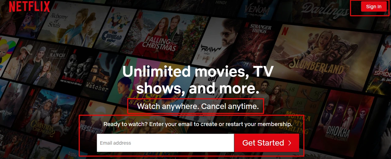
If we look at Netflix, we will see that they cleverly use a CTA with strong statements like “watch anywhere” and “cancel anytime.”
They also use a Sign-in button and a black space for email & Get Started text as CTA.
They are indeed one of the greatest examples of a successful CTA.
Another CTA example

If we also take a look at VISER X, we can see how they cleverly use a CTA with phrases like “Call Now” and “Get A Proposal.”
How to Create Compelling Calls to Action
Give effort on your call to action! Whether you believe it or not, they certainly make the route to making tons of purchases.
So, how to write one? Though there is no exact strategy, there are some tips you can follow to create an effective one.
Let’s see how:
1. Keep It Short and Simple
No one likes large and heavy texts. Everyone prefers simple and straight to the point.
After all, you are not here to brainstorm. Hence, one of the key points to an effective CTA is to keep the ad copy short and precise with actionable texts.
Here, the best practice is using two to three words but at most five to six.
Though it may seem like a few words, you need to close the deal with the help of these words. If you can, understand your copy is a success and vice-versa.
2. Use Actions Words and Phrases
Always use eye-catchy and actionable text to draw readers in. Everyone likes interesting action-oriented texts.
For instance, you have two options:
- Option 1: Click Here
- Option 2: Reserve your spot.
Now, as a reader, which option will you choose between 1 & 2?
Well, your answer will certainly be option 2. The first option looks very plain and boring. On the other hand, the second option comes with a force that ultimately results in more clicks.
Therefore, skip simple texts like submit, enter, and click. Instead, go for more compelling verbs such as get, read, and try while coupling them with certain phrases relevant to the offer.
Some good examples are:
- Try it out for free
- Get 30% off on your first order
3. Add a Sense of Urgency
“Grab your offer now; stock is limited.”
What will you do if you see such a query? Well, your brain will do its part by ultimately forcing you to make a purchase.
This is an effective tactic that marketers adopt to create a sense of urgency among people. So they cannot help but fall for it. And to a great extent, till now, it has been successfully attracting millions of people, resulting in higher click-through rates.
Some of the common examples of CTA button texts with a sense of extra urgency are:
- 60% off today on any purchase
- Only 10 spots left now!
- Hurry/place your order before the stockout
- Donate now—save a life.
4. Use Corresponding Landing Pages
Clicked on a call to action button, but it showed an error or the wrong info? What impression will you get?
Definitely bad! You put your trust in and click on it, and it directs you to the wrong webpage.
So, naturally, it will create a bad impression. Hence, always have a corresponding landing page ready with your unique call to action. Otherwise, your users will be clear to your conversion rate pretty badly.
5. Make Your Button Text Large and Readable
The text size of a call-to-action button plays a huge role in improving them. Keep the size neither too large nor too small. They should have the perfect readable format.
Users often leave the site merely because they don’t understand the button text or the large letters. So, keep the CTA buttons big enough to drive attention, but don’t overdo them.
6. Try Using the First Person
Always aim for the first person in your call to action. Below are two examples:
- Option 1: Start your free trial
- Option 2: Start my free trial
Which one will you pick among these two options? The majority of the people will pick option 2, without any second thought.
Any reasons for that?
Well, it’s human psychology. Both options indicate the same thing, just differences in the first and second-person usage. Still, most people will go for option 2.
Using the first person is a good practice, resulting in more clicks. However, it may even vary depending on the product and personality.
7 Tips to Make an Actionable CTA
As useful as CTAs can be, bad CTA cannot invite your audience to interact further, discover, or experience whatever you offer. Read up on the aspects below and learn how to make the perfect CTA.
- Keep it simple—the point is to give your audience a push.
- Add a sense of urgency—you need to drag it strategically up to add a CTA. That means your CTA also contributed to forming the urgency.
- Make it relatable—if you can do it, your target audience is already halfway to checking you out.
- Make it clear and concise—too many ideas can confuse your reader. And that will cloud their judgment to take your service.
- Direct customers' pain points—your target is to solve a problem of your customers by offering you service.
- Avoid using CTA with too many design elements—make the box small and simple yet noticeable.
- Test the button, including the color, size, and font of a button.
How to Use A/B Testing to Test CTAs
Advertisers have discovered data from the CTA to be an excellent chance for A/B testing, which evaluates the effectiveness of marketing strategies. For conversions, language and presentation are important. When given the option to "try it free" or "access now," those who dislike the term "free trial" can behave differently. It is possible to conduct testing almost in real-time, adjusting the CTA as information on click-through rates becomes available, especially in digital marketing.
A CTA may be the ultimate factor of an advertisement or only one of its many steps. Multiple CTAs will be present in sales filters where leads are gathered, managed, and converted.
Wrap Up
In this digital era, having an effective call to action is mandatory for gaining leads and boosting conversion and sales rates. That said, there is no way to shortcut or exact strategy for a perfect call to action. You just need to discover the most effective CTA for your business based on the context.
The more you can relate to and invoke them, the more you can keep your visitors engaged with your business. And once you can hit the bull’s eye, there is no returning. Success is sure to come.
Hopefully, now you understand what is CTA in digital marketing and its importance.
FAQs
Further confusion regarding the CTA in marketing? We have included this FAQ section to answer the most commonly asked questions.
Have a quick through them in case you have anything to clarify:
Why is CTA important for business?
A call to action is a crucial component of every webpage. Any forms of links and buttons with a call to action serve as waypoints, instructing users on what to do next. Thus the users find or understand how to make a purchase or join up for a service.
What are some compelling CTA types?
Call to action should always be: short, precise, and straight to the point. Some of the most compelling CTA types include the following: Buy now, download now, subscribe today, try the free trial, etc.
How does a CTA prompt someone to click?
Using an eye-catchy and relevant CTA is one of the most successful tactics to persuade visitors to click. It can be a cleverly positioned button, banner, customized QR code, link, or well-designed graphic.
Can I use multiple calls to action on one landing page?
Using multiple CTAs may distract the readers. So, stick to one CTA only for landing pages. Otherwise, your users will get confused seeing too many options with the ultimate result equal to zero clicks.
Is it necessary to include a CTA in every content you create?
Well, it is not mandatory. But adding CTA certainly makes the content more meaningful. While updating your material is crucial, it should also carry some purpose. Hence, the best is to include a clear and precise CTA with every content. It will encourage your readers to take action—complementing your overall marketing plan and conversion rates.


